Discover the power of Color Theory and its applications in art, design, psychology, and more.
Color theory is the study and practice of understanding how colors relate, interact, and influence each other. It plays a crucial role in various fields, including art, design, psychology, and even marketing. Color theory helps artists and designers create visually appealing and effective compositions by selecting and combining colors in a meaningful way.
The importance of color theory can be traced back to ancient civilizations, such as Egypt and Greece, where colors were used to convey specific meanings and symbolism.
In the 17th century, Sir Isaac Newton's experiments with light and prisms led to the development of the first color wheel, laying the groundwork for modern color theory.
The color wheel is a circular diagram that represents the relationship between colors. It is a valuable tool for artists, designers, and anyone interested in color theory. By learning how to use the color wheel, one can make informed decisions about color combinations and create harmonious designs.
The history of the color wheel dates back to Sir Isaac Newton, who, in 1666, developed the first circular color diagram while studying the spectrum of visible light (Try Color Picker to use color wheel). Since then, various versions of the color wheel have been developed, but the core principles remain the same.
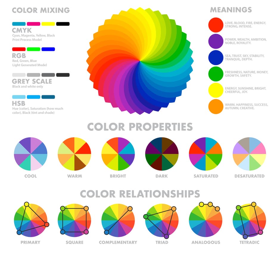
Primary colors are the base colors that cannot be created by mixing other colors. There are three primary colors: red, blue, and yellow. These colors form the foundation of the color wheel and serve as a starting point for creating other colors.
In the color wheel, the primary colors are evenly spaced, creating a visual representation of their relationship, and mixing primary colors in different combinations results in the creation of secondary and tertiary colors.
Secondary colors are created by mixing two primary colors in equal proportions. There are three secondary colors: green, orange, and purple. Green is formed by mixing blue and yellow, orange by red and yellow, and purple by red and blue.
Secondary colors occupy positions in the color wheel between the primary colors that were mixed to create them. This placement illustrates their connection to the primary colors and their role in forming tertiary colors.
Tertiary colors are created by mixing a primary color with a secondary color adjacent to it on the color wheel. There are six tertiary colors: red-orange, yellow-orange, yellow-green, blue-green, blue-purple, and red-purple.
These colors are situated between the primary and secondary colors combined to produce them. Tertiary colors add more variety to the color wheel, allowing for a greater range of color combinations and schemes.
Colors are often categorized as warm or cool based on their perceived temperature. Warm colors, such as red, orange, and yellow, evoke warmth and energy. Cool colors, such as blue, green, and purple, convey a sense of calmness and tranquility.
The color wheel can be divided into two halves to illustrate the distinction between warm and cool colors. This division can help designers and artists create balance and contrast, using warm and cool colors to evoke different emotions and atmospheres.
Understanding the color wheel helps you create various color schemes, such as:
Monochromatic: Using different shades, tints, and tones of a single color.
Complementary: Combining colors that are opposite each other on the color wheel.
Analogous: Using colors adjacent to each other on the color wheel.
Triadic: Choosing three colors evenly spaced around the color wheel.
Tetradic: Selecting two pairs of complementary colors, forming a rectangle on the color wheel.
Color properties are the fundamental characteristics of color, which help us understand and identify the different ways colors can be described and manipulated.
Understanding color properties is crucial for artists, designers, and scientists alike, as it allows them to create visually appealing and functional designs and interpret and communicate data effectively.
The study of color properties has evolved throughout history, with early concepts emerging in ancient civilizations and further developed during the Renaissance period.
Hue is the most basic and readily identifiable property of color. It refers to the dominant color family a color belongs to, such as red, blue, or green.
The use of hues allows us to easily identify and differentiate colors based on their distinct visual characteristics.
Examples of different hues include primary colors (red, blue, and yellow), secondary colors (green, orange, and purple), and tertiary colors (formed by mixing primary and secondary colors).
Saturation describes the intensity or purity of a color, which is determined by the amount of gray present in the color. A highly saturated color appears vivid and bold, whereas a low saturation color appears dull and washed out.
For example, a highly saturated red appears bright and intense, while a less saturated red appears more subdued or muted.
Brightness, also known as a value, refers to the lightness or darkness of a color. It is determined by the amount of white or black present in the color.
High-brightness colors appear lighter, while low-brightness colors appear darker. For example, a high-brightness yellow appears light and airy, whereas a low-brightness yellow appears more mustard-like.
Color models are mathematical representations of color spaces, which describe the relationships between colors and provide a systematic approach to manipulating and reproducing them.
Examples of different color models include RGB (Red, Green, Blue), used in digital displays; CMYK (Cyan, Magenta, Yellow, and Key [black]), used in print; and HSL (Hue, Saturation, Lightness) and HSV (Hue, Saturation, Value), used in computer graphics and design.
Each color model represents color properties in a unique way, allowing for precise control and communication of color information.
The Munsell Color System is a three-dimensional color model that represents color properties using hue, value (brightness), and chroma (saturation).
Developed by American artist and educator Albert H. Munsell in the early 20th century, the Munsell Color System provides a standardized and perceptually uniform method for specifying colors.
The system is widely used in art, design, and various industries, including soil science and colorimetry, to ensure accurate color communication and consistency.
Numerous other color systems represent color properties in different ways, catering to the unique needs of various industries.
Examples include the Pantone Matching System (PMS), used in graphic design and printing to ensure accurate color reproduction; the Natural Color System (NCS), based on human perception of color and used in architecture, interior design, and product design; and the CIELAB color space, which is a perceptually uniform color space used in color science and color management.
Each of these color systems offers its own unique method for representing and communicating color properties, enabling accurate and consistent color use across diverse applications.
Color harmony is achieved when colors in a composition work together to create a visually pleasing and engaging experience. By understanding and applying various color schemes, you can create harmonious color palettes:
Monochromatic colors are color schemes that consist of a single hue but incorporate various shades, tints, and tones of that color.
The term "monochromatic" is derived from the Greek words "mono," meaning single, and "chroma," meaning color.
This color scheme creates a cohesive and harmonious visual effect, as it relies on a single base color, making it an appealing choice for various applications, including art, design, and fashion.
Examples of monochromatic color schemes can be created by selecting a base color, such as:
Once a base color is chosen, monochromatic color schemes can be developed by adjusting the brightness and saturation of the hue, creating shades (adding black), tints (adding white), and tones (adding gray). This process results in a range of colors derived from the same hue, providing a sense of unity and consistency.
Complementary colors are pairs of colors that are opposite to each other on the color wheel. When combined, these colors create a strong contrast and visual balance, as they effectively cancel each other out.
Some examples of complementary colors include:
These pairs are derived from the color wheel, a circular representation of colors organized according to their chromatic relationship. By identifying the color directly across from a chosen color on the wheel, one can easily determine its complementary counterpart.
Analogous colors are groups of colors that are closely related to each other on the color wheel. They typically consist of three colors that are adjacent to one another, creating a harmonious and visually pleasing effect.
Examples of analogous colors include:
Analogous colors can be identified by selecting a primary color on the color wheel and then choosing the two colors immediately adjacent to it. This grouping creates a smooth transition between hues, creating a subtle and calming effect. The color wheel uses analogous colors to create a sense of harmony and balance.
Triadic colors are sets of three colors evenly spaced around the color wheel, forming an equilateral triangle. This color scheme balances contrast and harmony, as the colors are neither too similar nor too different from one another.
Examples of triadic color combinations include:
To identify triadic colors on the color wheel, choose a primary color and then find the two equidistant colors from it, forming an equilateral triangle. This configuration ensures a visually appealing combination of hues that are both contrasting and harmonious.
Tetradic colors, or double-complementary colors, are sets of four colors that consist of two pairs of complementary colors. This color scheme offers a rich and diverse range of hues, providing ample contrast while maintaining balance and harmony.
Examples of tetradic color combinations include:
First, choose a pair of complementary colors to determine a tetradic color scheme on the color wheel. Next, select another pair of complementary colors perpendicular to the first pair, effectively forming a rectangle or square on the color wheel. This arrangement yields a diverse and balanced palette that can be adapted to various creative applications.
Colors can evoke emotions, moods, and even memories. For example, red is often associated with passion, excitement, and energy, while blue conveys tranquility, trust, and stability. Cultural and historical connotations can also influence the meaning of colors, making it essential to consider the context when selecting colors for a project.
Color psychology plays a significant role in branding and marketing, as it helps businesses create a specific image and evoke desired emotions among their target audience.
Color theory is widely applied in various fields, including:
Art and design: Artists use color theory principles to create visually captivating and harmonious works.
Interior design and architecture: Designers apply color theory and different color names to create functional and aesthetically pleasing spaces.
Fashion and textiles: Designers use color theory to create visually appealing garments and fabric patterns.
Film and animation: Filmmakers and animators use color theory to evoke emotions, set the mood, and create visual interest.
Website design and digital media: Designers use color theory for HTML and CSS color codes to create user-friendly and visually appealing digital experiences.
The primary colors are red, yellow, and blue. These colors cannot be created by mixing other colors.
A complementary color scheme is created by selecting two opposite colors on the color wheel: red and green or blue and orange.
Hue refers to the base color, saturation describes the color's intensity or purity, and brightness indicates the amount of light in the color.